01. Project Overview
LUMEE is a smart study lamp designed to make studying more interactive through an integrated display and intelligent features.
The project involved redesigning an existing product to address physical design and manufacturing challenges while improving the digital experience presented on its screen.
Rather than starting from scratch, I worked within the existing product concept and focused on making the design more practical, visually refined, and cohesive.
My contribution
- Physical product redesign
- 3D modelling and design refinement
- Design for 3D printability
- Screen UI redesign
- Visual hierarchy and interaction design
02. The Challenge
The existing design had potential, but several aspects needed improvement before it could become a more refined and practical product.
Physical design challenges
- Neck printability: The abrupt transition between the circular body and rounded-rectangular head created an unnecessarily complicated geometry for 3D printing.
- Base stability: The original base needed improvement to provide better stability.
- Display size: The screen needed to be larger to offer a better interface experience.
- Head proportions: The lamp head needed to be reconsidered in relation to the overall proportions and weight of the product.
Digital interface challenges
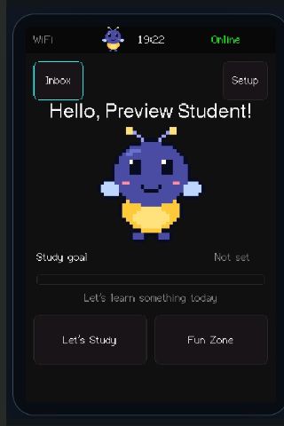
The existing screen interface felt more like a basic embedded-system interface than a finished consumer product.
- Pixelated graphics and visual elements.
- Oversized typography with limited hierarchy.
- Inconsistent spacing between interface elements.
- Basic button styling and limited visual distinction between actions.
- An overall visual experience that lacked consistency and refinement.
The objective was to improve both the physical product and the experience of interacting with it.
03. Physical Product Redesign
Refining the form
I focused on improving the product's proportions and geometry while retaining its original identity.
1. Neck geometry
The original neck transitioned abruptly from a circular form into a rounded rectangle over a short distance.
I redesigned this transition to be more gradual and uniform, creating a smoother connection between the body and the head.
This helped simplify the geometry for 3D printing while giving the product a more continuous appearance.
2. Base stability
I increased the size of the base to improve the lamp's stability and provide a more balanced foundation for the structure.
3. Display integration
I increased the screen size to create more room for the interface and improve the overall viewing experience.
4. Lamp head proportions
I reduced the size of the lamp head to improve the overall visual balance and reduce the weight carried by the neck.
04. Before & After — Physical Design
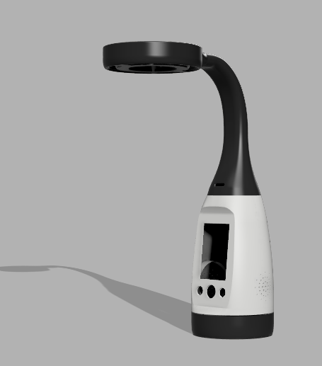
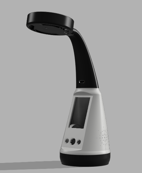
The previous design is shown first, followed by the redesigned model. Supplied 3D views are shown from different angles.
The redesign focused on four key changes:
| Design element | Original | Redesigned |
|---|---|---|
| Neck | Abrupt geometric transition | Gradual, continuous transition |
| Base | Smaller footprint | Larger footprint for stability |
| Display | Smaller screen | Larger screen |
| Head | Larger proportions | Smaller, lighter form |
The result is a more balanced product with improved geometry and a more practical physical configuration.
05. Digital Interface Redesign
From pixelated to modern and minimal
The physical redesign was only one part of the project. I also reworked the complete screen interface to give LUMEE a more polished digital identity.
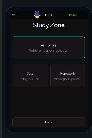
The original interface used pixelated graphics, oversized text, and limited spacing. Although the basic functionality was present, the visual presentation felt dated and lacked a consistent design system.
I approached the redesign with one central goal:
Make the interface feel like a thoughtfully designed part of the product, rather than a basic screen added to it.
Key design improvements
Typography and hierarchy
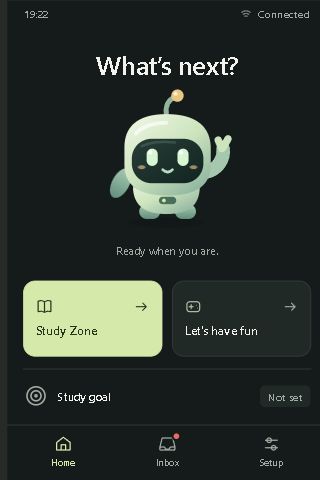
Replaced oversized typography with a more balanced type scale. Headings, supporting information, and actions now have clearer visual distinction.
Spacing and layout
Introduced more consistent spacing between elements, giving each section room to breathe and making the interface easier to scan.
Visual identity
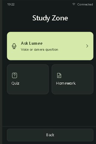
Moved away from the pixelated visual style towards a modern, minimal aesthetic using a dark green foundation and soft lime-green accents.
Components and interactions
Redesigned buttons, cards, and interactive elements with rounded corners, subtle borders, icons, and clearer visual emphasis.
Navigation
Introduced a consistent bottom navigation system for Home, Inbox, and Setup, making the main sections easier to access.
06. Redesigning the Core Screens
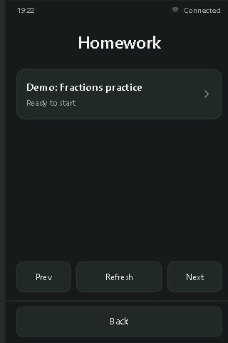
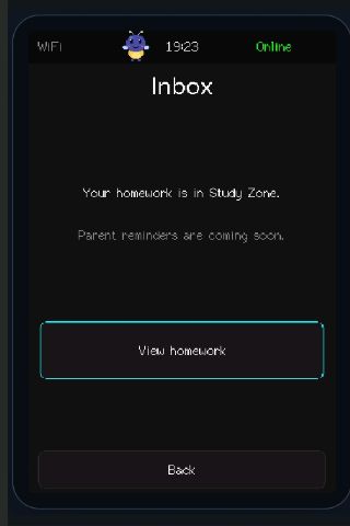
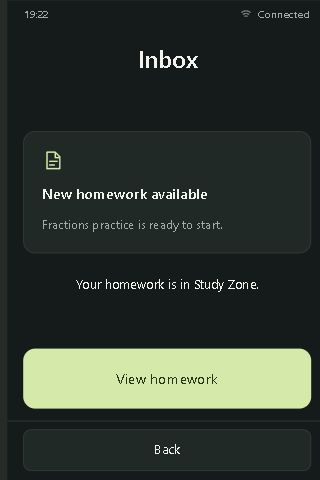
Captured from the LUMEE comparison prototype. Each pair shows the same screen before and after the redesign on a 320 × 480 display. The browser concept simulates interface states; it does not replace the original firmware.
Home
The previous home screen presented several elements with limited hierarchy. The new home screen introduces a clearer welcome area, a friendly LUMEE character, and two prominent entry points: Study Zone and Let's Have Fun.
Study Zone
The Study Zone screen organizes the main learning features into a more structured layout, with Ask LUMEE, Quiz, and Homework presented as distinct interactive cards.
Ask LUMEE
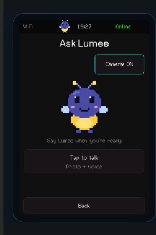
The redesigned screen gives the voice interaction a more focused presentation. The character becomes the visual focal point, while the primary action is clearly highlighted.

Homework
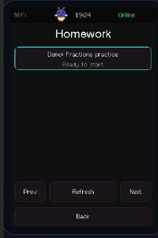
The homework screen uses a cleaner content card to present the assignment and its status. Navigation controls are positioned consistently at the bottom.
Inbox
The redesigned inbox makes notifications more informative by presenting homework updates with clearer titles, supporting descriptions, and a prominent View Homework action.
Screenshot source: LUMEE · Interactive UI comparison ↗
07. Bringing Both Experiences Together
The physical and digital redesigns were developed as two parts of the same product experience.
The larger display provides more room for the redesigned interface, while the updated visual language makes the screen feel more consistent with the refined physical form.
The redesigned neck, larger base, and smaller head improve the physical proportions, while the updated interface creates a cleaner and more approachable interaction experience.
The goal was not just to make LUMEE look better, but to make the complete product feel more considered.
08. Final Outcome
The redesign addressed the key challenges identified in the original product while improving the overall experience.
Physical improvements
- More gradual neck geometry for improved 3D printability.
- Larger base to improve stability.
- Larger display for a better viewing and interaction area.
- Smaller lamp head for improved proportions and reduced weight.
Digital improvements
- Modern and minimal visual language.
- Better typography and information hierarchy.
- Consistent spacing and component styling.
- Improved navigation and screen layouts.
- Clearer presentation of the product's core features.
09. Key Learnings
This project helped me understand how physical product design and digital interface design influence each other.
I learned to look beyond individual visual elements and consider the complete product experience — from manufacturing constraints and structural proportions to screen layouts and user interactions.
It also reinforced the importance of designing within existing product constraints. A successful redesign does not always require starting over; sometimes, carefully identifying and addressing the right problems can make a significant difference.
LUMEE — A more refined physical product with a more thoughtful digital experience.